Monday, November 21, 2011

Top Trumps!
For this project I had to create me own Top Trump card, I was given the template but I then had to edit it all to fit my card, it challenged my ability of using illustrator and indesign as I have not used them a lot, it was hard to get the hang of, but the tutorials my tutors gave me was really good! Here is my card, it took me one nights to do the best I could as there was a lot of learning to do.

Sunday, November 20, 2011

Wing Of a Bee 2.


This is the colour version of the wing of a bee project. As I didn't read the brief properly where it said it had to be in full colour! This is the end result.

Thursday, November 17, 2011

Wing Of A Bee.


With this project we had two weeks to complete, after coming up with designs after designs this was the one i came up with. I wanted something to do with floral, but at the same time not to make it look so feminine. I then went on to go with the theme of Nature. This was actually my second design, as the first one it wasn't really communicating well according to my feedback sheet. It took me about 3 days to complete the hand drawn version on A2. But with the illustrated version it was a totally different story. As I have never used illustrator before, this was a big challenge for me, even with the illustrator tutorial with my tutor Dan, I still found this very hard. In the end it took me about a week and a half to finish this. But I am very happy with the final outcome.

Thursday, November 3, 2011

100 New Uses For A Brick Part 2.


The second part of the project was to complete the 100 new uses of a brick digitally. I used photoshop as I don't know how to use illustrator well, I used the pen tool to create all my brick designs and used the typeface 'Arial' to label each design. It took me a few days, but the end product I am very satisfied with. 
100 New Uses For A Brick.

The first part of the project was to draw out 100 new uses for a brick, it was a challenging task, but very fun as it worked with your imagination and I was able to see how much I went out of the box, here are my 100 sketches that I completed during today's lesson.

Monday, October 24, 2011

Matchmaker.


This was a project for a real client 'Jotta'. We were given a brief that we had to design wrapping paper, so that it would be used for diplay on the window which would be covering a big present box. The wrapping paper we had to design was for a clothing store, which sold big fashion labels. I found this project really hard, but I did try my best, I went with something simple, as i thought that would look best as the website for 'Matches' was very simple and clean. The first design is just basic stripes from a few colours I picked up from a few dresses on the website, and the other design is a typography type wrapping paper. I thought this would be fun, and would give more of a Christmas feel. I used the quote "Fashion Fades, Style is External" I really liked the quote and thought it worked well with the Shop itself. I used the font "Chopin Script" as I think calligraphy writing seems to give out more of a Christmas feel.


Above another design I had come up with, and was my final design for the wrapping paper. I decided to go with a repetitive pattern as I thought that it would look best. I designed this using photoshop, I've also tried to do a few colours.
Below are the two I sent of to Jotta. Unfortunately I never got chosen, but it was real fun to do a live project. 


Pay To Play


This was a project where we had to design a pound coin fora cash prize of £50 for first place, we had to follow a brief to design what was meant to be on the coin as a design, this was to express the current global finacial climate.
On the front of the pound coin, I chose to put a design of an iceberg with the water at the bottom to show that we are losing the ice around the world because of the climate, and on the back of the coin, I chose to put a design of the globe with flames coming out of it on the side. This shows that because of the climate change, we are slowing burning everything and getting rid of it due global warming.
With the colours, I chose to keep it simple with just having the coin as the goldcolour as it normally would be on a pound coin and have the deisgn in black.
I also made a little model which was the same size as a real pound coin, I tried to carve the image in it so that i wouldn't have to spoil the look of how a real coin would look, but it wasn't really visable, which meant I had to go over the outline in black. Above is the hand drawn version of the coin before I designed it digitally using photoshop.

Tuesday, October 18, 2011

Meet Me On The Corner Part 2.


This is the map I had designed for the Meet Me On The Corner trip, where we had to travel to 40 different locations. This project shows mapping and way finding. I had decided to put it out onto a tube map, but I didn't exactly place the places I had visited where they actually was. I decided that to use the whole tube line would show what this project is all about, and it is still a map. 

Friday, October 14, 2011

Meet Me On The Corner.


The first stop was to American Apparel, I tried on a skirt.


The next stop was to Liberty, we had to take pictures on the stairway.


Then to the apple store on Regents street to check out email, where we saw tributes for Steve Jobs. RIP. xx


When we got to the Photographers Gallery, it was closed, so we took unusual pictures against the sign explaining why it was closed.


We then went to two different Record stores on Berwick Street.


The next stop was Star Cafe, where we stopped to have lunch.


Lying down in Soho Square.


Photography Bookstore! where I got to look at some good books.


Music store on Denmark Street and outside No 6 where the Sex Pistols used to live.


Geeking it  out in Forbidden Planet!


The strong smell of coffee.


Cheese? Not really my thing! Couldn't stand the smell of the store.


Amazing Graphical Skate board designs in Slam Skate City.


Oh no the Paparazzi at The Ivy!!


At the London Graphics Centre in covent Garden! Popped in to buy a new lead pencil and some 0.3 lead.


Magma Book store.


And finally, the most challenging task out of the 40! Van Gogh's sunflower painting in The National Gallery. 

Thursday, October 13, 2011

Guidelines


Guidelines Booklet for 'Brand me up Buttercup!'

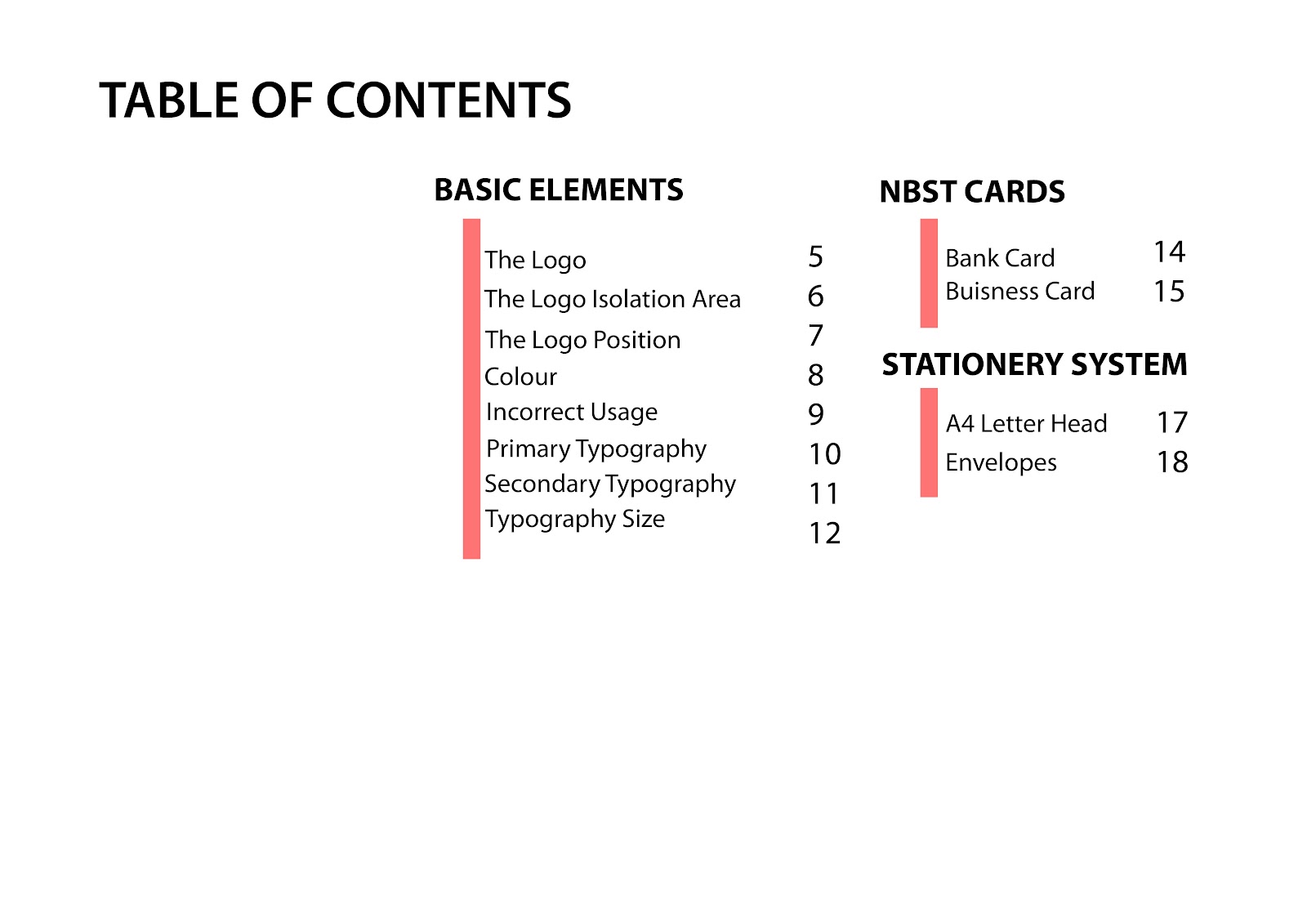
With the 'Brand me up Buttercup' project, I decided to take it a little bit further, and create a Guideline booklet for the brand itself. I decided to turn it into it's own company and brand. Here are the contents of the booklet.